Revolutionizing food distribution for underprivileged communities in Chhattisgarh

Revolutionizing food distribution for 
underprivileged communities in Chhattisgarh

Helping shopkeepers enhance food distribution efficiency and customer satisfaction through streamlined and swift transactions

Design Lead

9 Months


This Is Only a Glimpse.

If you're curious for the full scoop, hit me up on LinkedIn or shoot me an email at emailsofvinit@gmail.com. Let’s connect!"

This Is Only a Glimpse.

If you're curious for the full scoop, hit me up on LinkedIn or shoot me an email at emailsofvinit@gmail.com. Let’s connect!"

This Is Only a Glimpse.

If you're curious for the full scoop, hit me up on LinkedIn or shoot me an email at emailsofvinit@gmail.com. Let’s connect!"

What is CORE PDS ?

A Game-Changer in Public Distribution

COREPDS, launched in 2014, is an application designed to manage and distribute essential commodities to poor and underprivileged communities. It digitalized food distribution and achieved significant success, receiving multiple awards for its innovative approach.

Monthly Rations for $1 Only.

Helping Millions of Poor and Underprivileged Families

Helping Millions of Poor and Underprivileged Families

Background

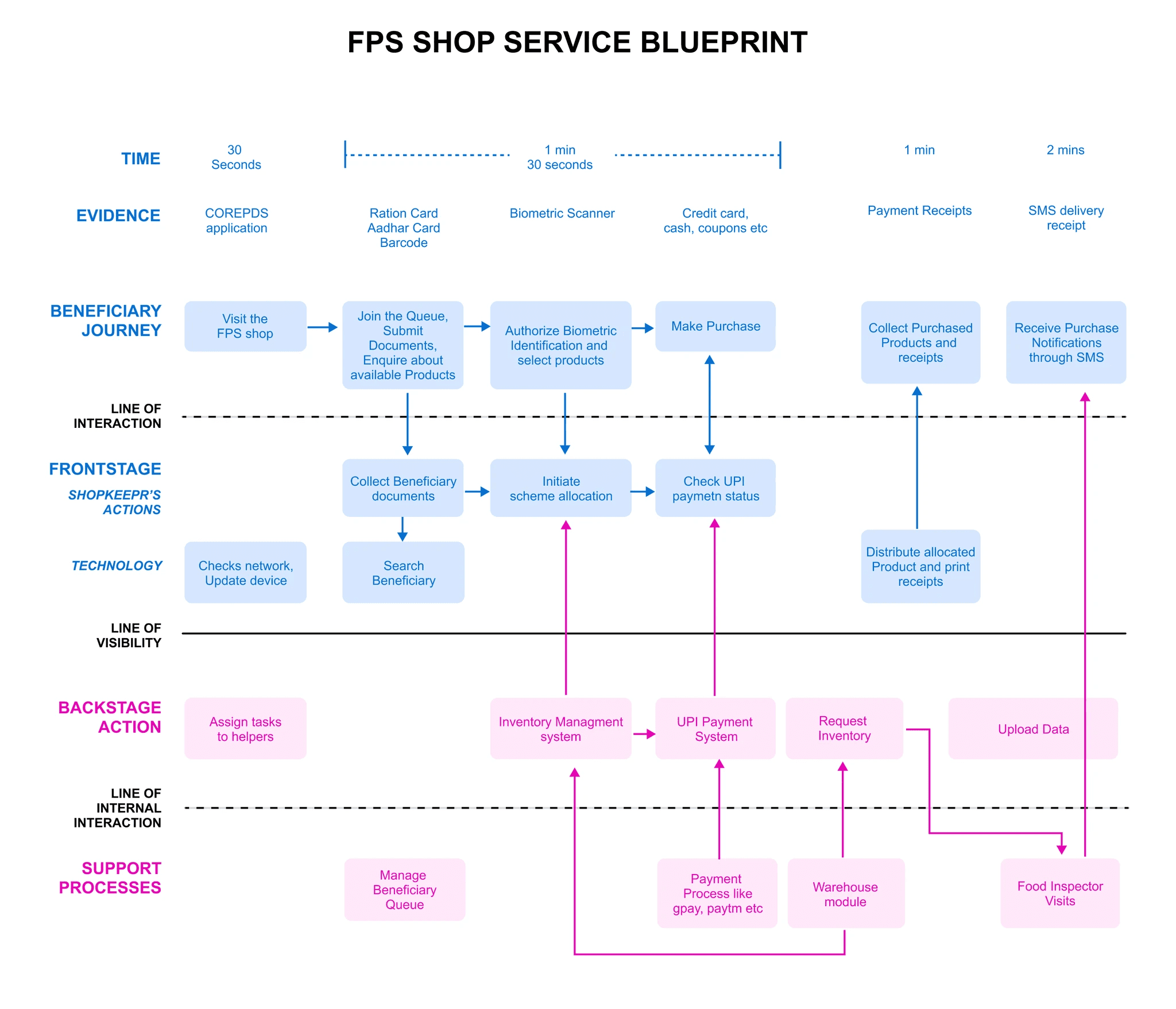
COREPDS application and device failed to handle explosive growth

COREPDS application & device failed to handle explosive growth

COREPDS started as a model project prototype with a few shops and expanded to over 12,000 shops in five years, but the 2016 app and devices couldn't handle the growth.


This led to increased customer complaints and declining distribution rates, highlighting the need for significant improvements to meet the demands of the expanding food distribution network.

UX Research

Shopkeepers need simplified transactions with integrated functionality.

Effective management and distribution of essential commodities are critical for the success of CORE PDS Chhattisgarh.


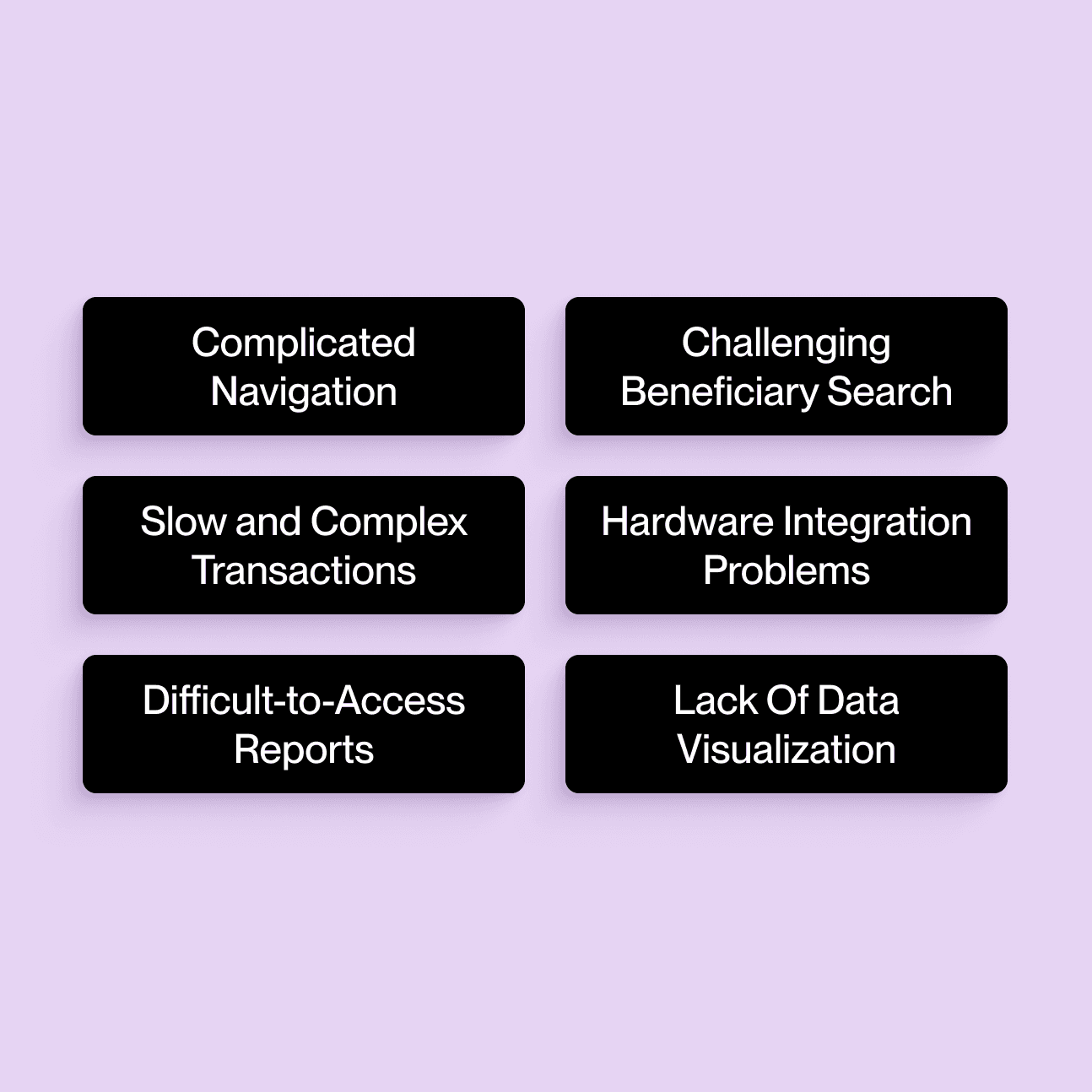
Our UX research team identified six core problems faced by distributors that our design team must address to enhance efficiency, usability, and transparency in the distribution

5 focus group discussions in five differen districts
10 usability testing sessions in most problematic shops
72 hours of in store observations
10 one to one user interviews with the shopkeepers
15 beneficiary interviews
Approach

We approached by swiftly designing and brainstorming UI concepts for the new hardware device

The hardware team finalized an advanced EPOS device with a large touchscreen and integrated biometric scanning, barcode reading, and printing capabilities for optimal functionality.

As we innovate with the COREPDS system, We swiftly validated ideas to enhance shopkeeper efficiency, completing each experiment in under a quarter.


We monitored metrics and shared insights on transaction speed, beneficiary management, and data analytics for continuous improvements.

Design Thinking

Designing for Inclusive Accessibility

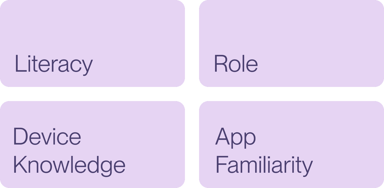
The COREPDS app's original design didn't fully accommodate the diverse needs of all users, particularly those with limited education or tech experience. To address this, we adopted a more inclusive approach, ensuring the design worked for everyone.

Spectrums of Challenges

We recognized that users face temporary or permanent challenges that affect how they interact with the app. By understanding these spectrums, we ensured the app could adapt to various needs.

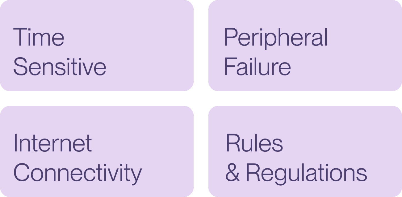
Situational Challenges

We also considered how certain situations, like a busy shop or a power outage, might temporarily affect how users interact with the app. This focus helped us design for real-world scenarios.

We also considered how certain situations, like a busy shop or a power outage, might temporarily affect how users interact with the app. This focus helped us design for real-world scenarios.


Navigating Conflicts

Resolving Stakeholder Disputes Over New Device Allocation

A major conflict arose among stakeholders regarding fund allocation for the proposed new device. Many doubted its usefulness due to a lack of technological knowledge, while a few supported it. 

To resolve this, I reached out to several device manufacturers and secured at least one device for demonstration. After real-time testing, the superior performance of the new device became evident, highlighting its potential to improve transaction speed and efficiency.

Solution

Ensuring Future-Ready Scalability and Performance

The redesigned COREPDS application guarantees scalability and adaptability, featuring enhanced functionalities that support future growth and manage increased loads without compromising performance.

Express Checkout

01

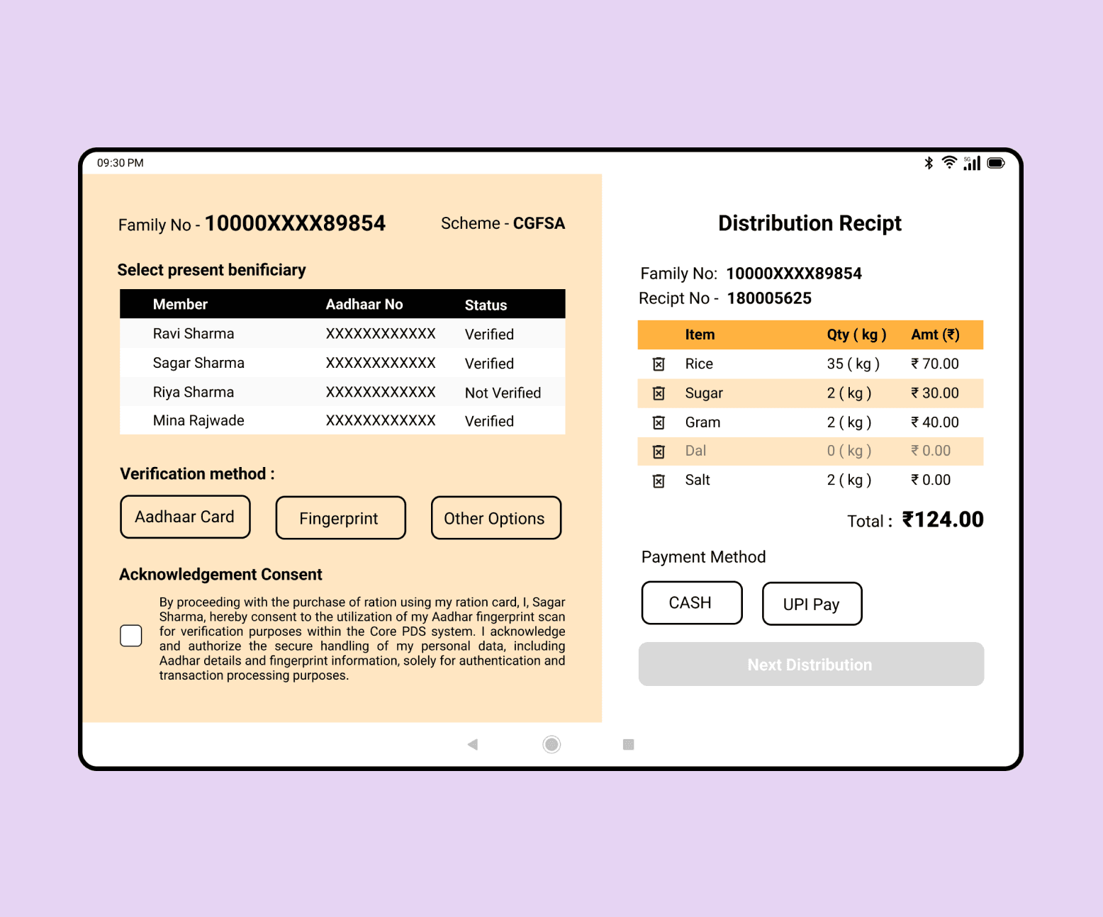
With just three clicks across two streamlined screens, shopkeepers can quickly select beneficiaries, process orders, and finalize sales.


This intuitive feature reduces complexity, enhances speed, and simplifies transactions, empowering shopkeepers to serve beneficiaries with ease and efficiency.


  • 132 secs reduction in transaction time

  • 27% increase in daily beneficiaries served

01

Express Checkout

With just three clicks across two streamlined screens, shopkeepers can quickly select beneficiaries, process orders, and finalize sales.


This intuitive feature reduces complexity, enhances speed, and simplifies transactions, empowering shopkeepers to serve beneficiaries with ease and efficiency.


  • 132 secs reduction in transaction time

  • 27% increase in daily beneficiaries served

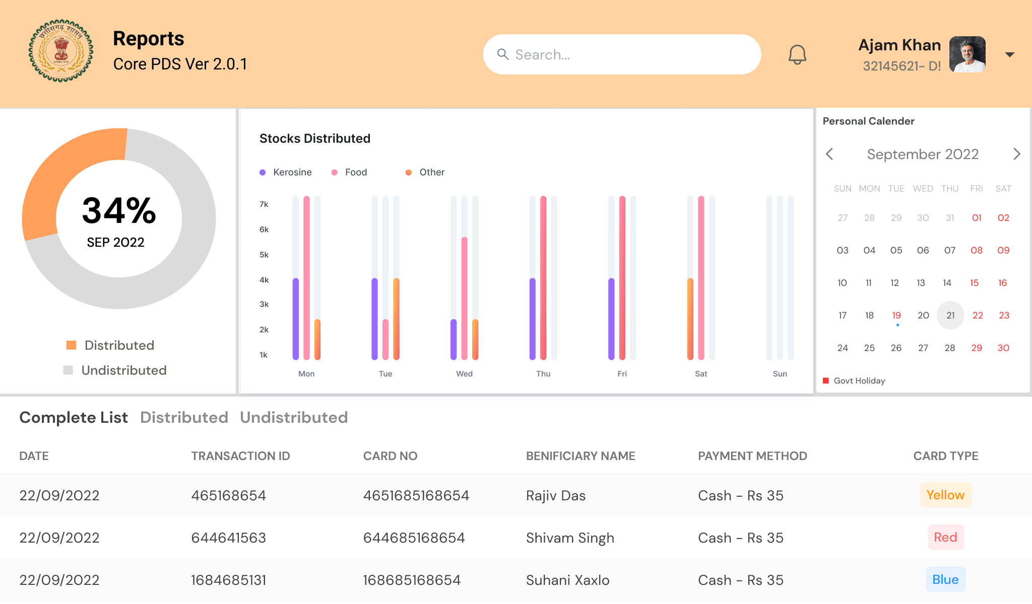
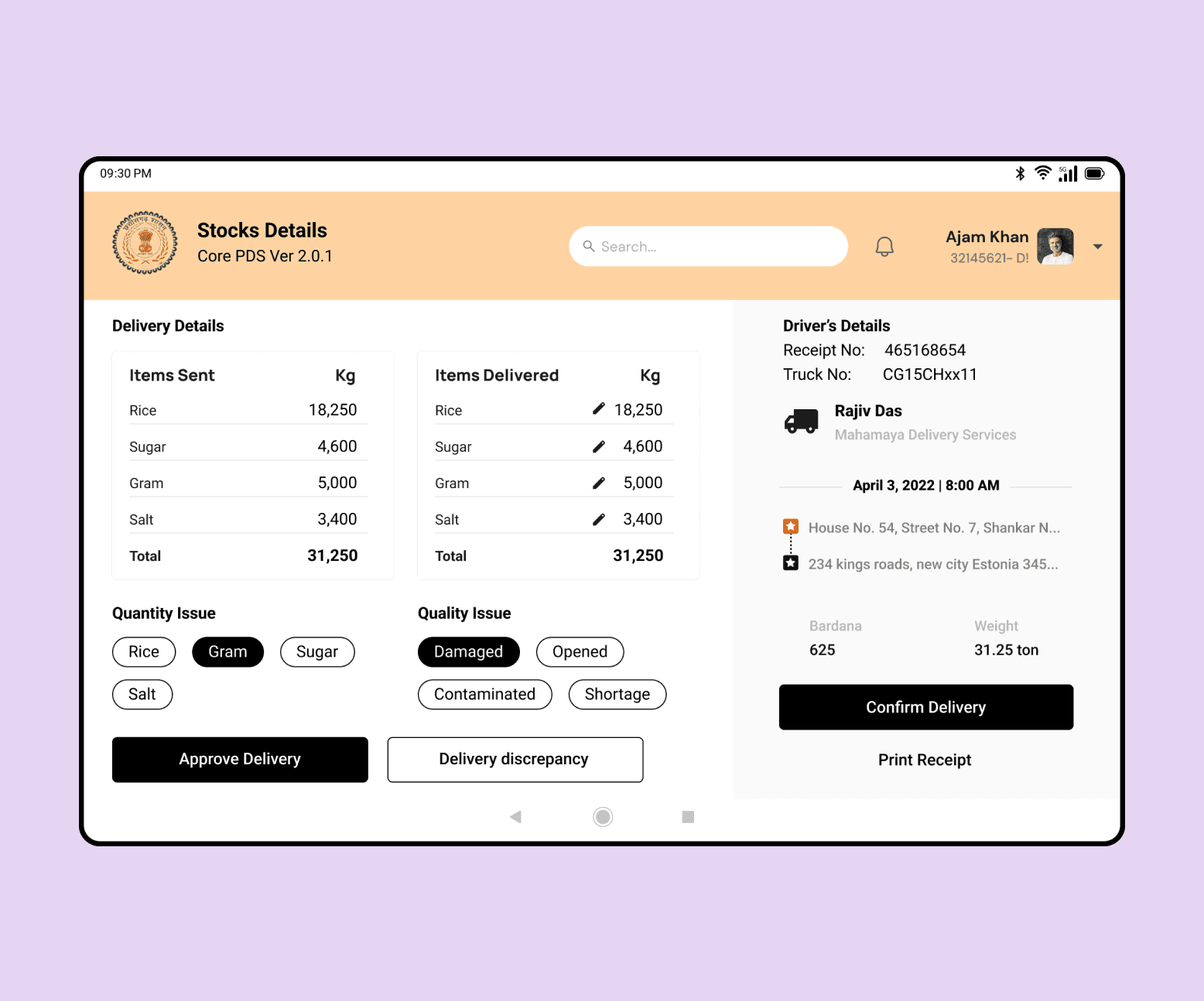
Adding inventory Visualization and Reporting functionalities

02

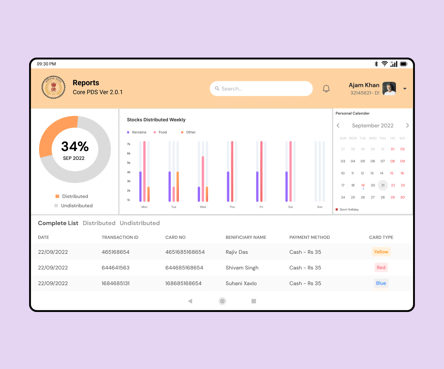
We introduced insightful dashboards featuring data visualization tools such as pie charts and bar graphs, enhancing inventory and distribution management. 


Additionally, simplified reports provide detailed insights for shopkeepers to monitor distribution effectively and manage stock efficiently, supporting streamlined operations and informed decision-making.


  • 72% improvement in stock management efficiency

  • -65% reduction in stock discrepancies

02

Adding inventory Visualization and Reporting functionalities

We used real-time inventory data to help shopkeepers manage stock levels better, ensuring they are always ready to meet demand without errors or overstocking.


  • 72% improvement in stock management efficiency

  • -65% reduction in stock discrepancies

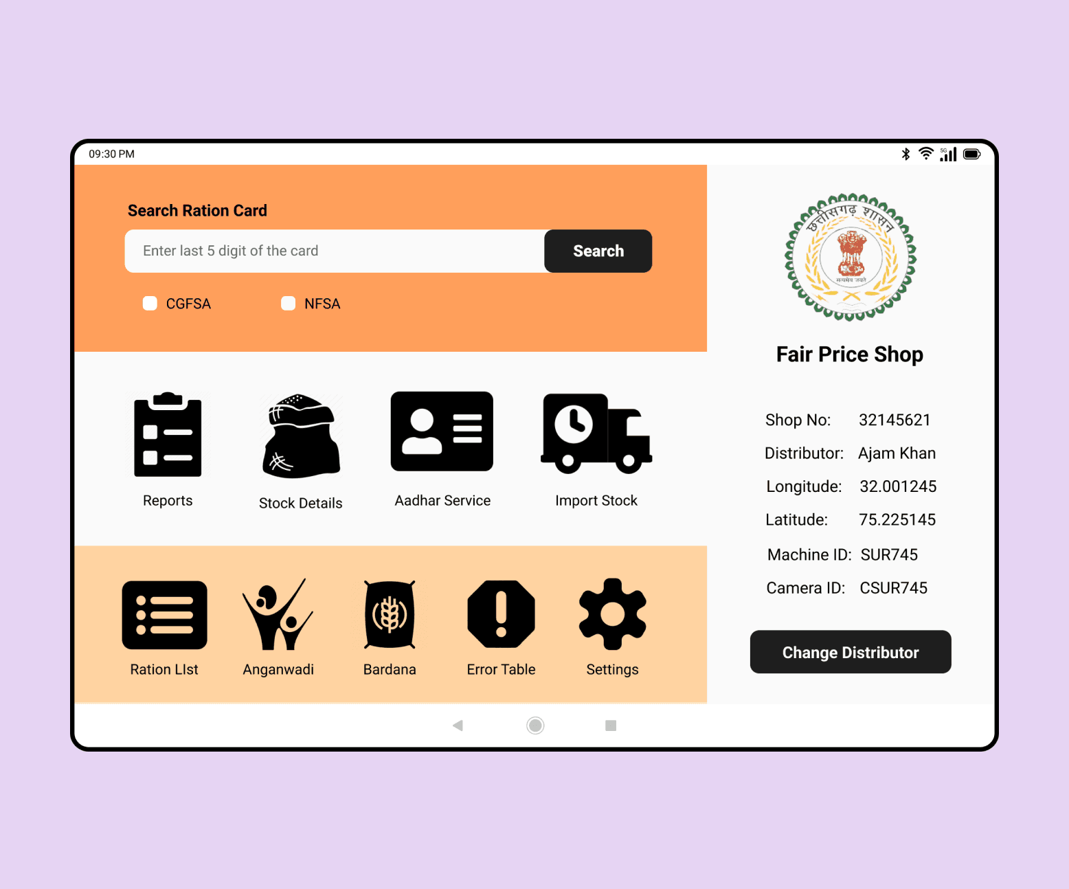
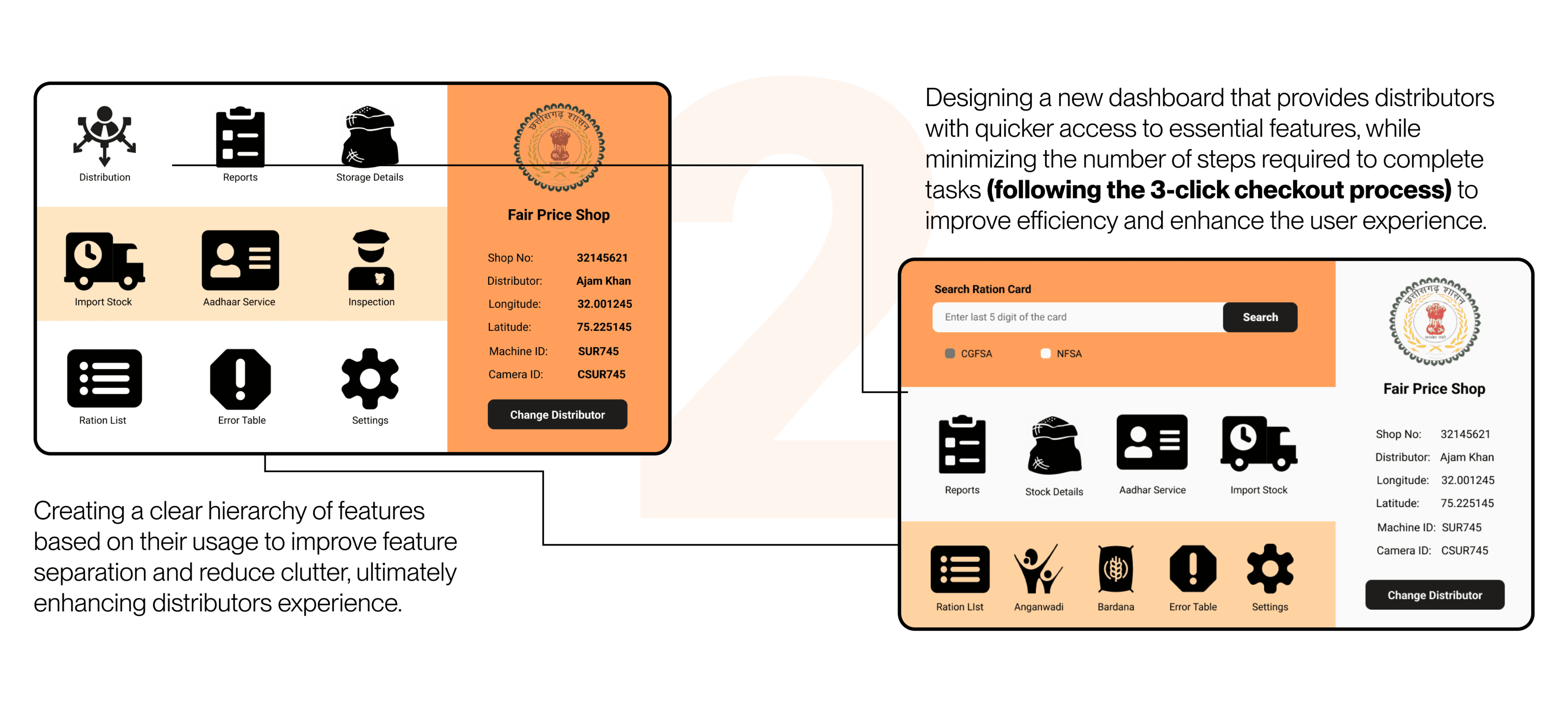
Streamlining Navigation with Intuitive Icons

03

With just three clicks across two streamlined screens, shopkeepers can quickly select beneficiaries, process orders, and finalize sales. This intuitive feature reduces complexity, enhances speed, and simplifies transactions, empowering shopkeepers to serve beneficiaries with ease and efficiency.


  • 74% navigation speed boost

  • 83% reduction in errors

03

Streamlining Navigation with Intuitive Icons

With just three clicks across two streamlined screens, shopkeepers can quickly select beneficiaries, process orders, and finalize sales.


This intuitive feature reduces complexity, enhances speed, and simplifies transactions, empowering shopkeepers to serve beneficiaries with ease and efficiency.


  • 74% navigation speed boost

  • 83% reduction in errors

04

Improved Search Functionality

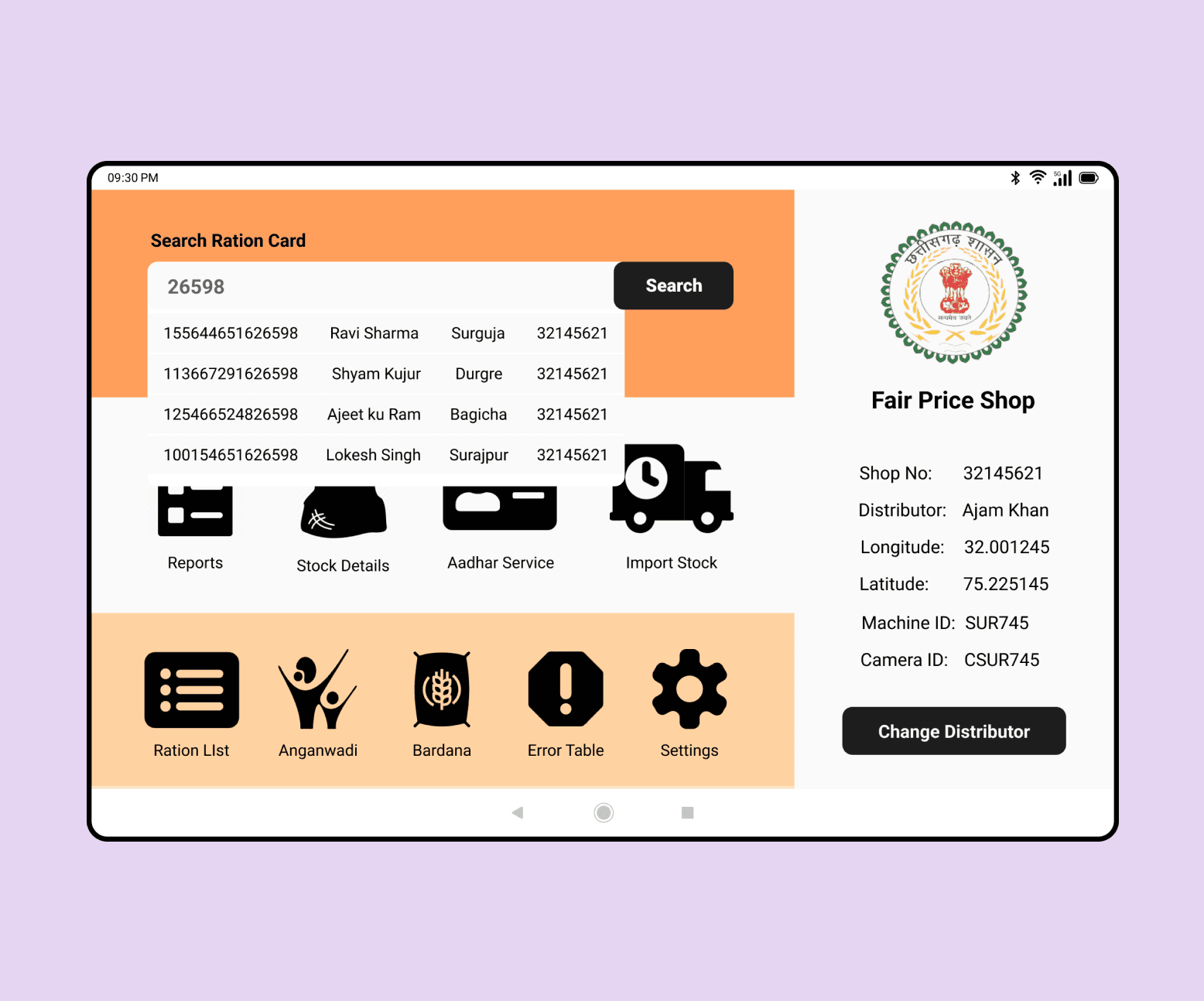
Addressing the challenging card and beneficiary searches that previously required a 16-digit number.


The new redesigned search bar allows searches using the last 5 digits of ration cards, barcode scans, and Aadhar cards, enhancing user experience by providing quicker access to beneficiary details.


  • 87% decrease in search time

  • 72% reduction in beneficiary search errors

User testing and improvement

Optimization and Hypothesis validation

To optimize user experience, we conducted rigorous AB testing sessions over two months for optimization and hypothesis validation. These sessions gathered user feedback and insights to refine design elements and functionalities, ultimately enhancing the application's usability and efficiency.